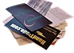
 The other day I was sifting through about 1000 business cards I’ve collected over the years.
I noticed a few things that frustrated me:
1. No email address. Come on. It’s 2007. People aren’t going to look online for your email, or worse yet, guess what your email is.
2. Mismatched email. You have a website, yet your email is mike233@aol.com. Where’s the consistency? Furthermore, using AOL, Hotmail or Yahoo takes your level of professionalism down a few clicks.
3. Tiny print. I’m only 27 and my eyes hurt looking at some of these cards. Remember, there’s two sides. S-P-A-C-E—I-T—O-U-T!
4. TMI. Too much information. (That’s what websites are for!) Pick a few important things and keep it simple.
5. Folded cards. I understand the allure of folded cards: more surface area and it stands out in people’s stacks. But I have to be honest, every time I get a folded card and it doesn’t lay flat on my stack, I either throw it out or rip it in half. I dunno. Maybe it’s just me.
6. Duh! One man who works in real estate has a little heart on his card that says, “I LOVE REFERRALS!” Well DUH! Who doesn’t? And once again, maybe it’s just me, but seeing that little icon makes me NOT want to give him referrals. Almost like he’s desperate.
7. Ironic. I remember one card that was particularly unattractive: flimsy stock, bad colors and hard-to-read lettering. Take one guess what that woman’s job was: graphic designer. Ouch.
8. Quote. One person’s card had a quote from Oprah Winfrey. I don’t remember what the quote was, and I also don’t remember whose card it was. All I remember was Oprah. So my question is: WHY WOULD YOU QUOTE SOMEONE ELSE ON YOUR OWN BUSINESS CARD?!! If you have to quote someone, quote yourself!
LET ME ASK YA THIS…
What are your Bad Business Card pet peeves?
LET ME SUGGEST THIS…
Post your list here!
* * * *
Scott Ginsberg
Author/Speaker/That Guy with the Nametag
www.hellomynameisscott.com
